Overlapping Bar Chart in Excel (How to Add It in 2025)
In this article, we will show you how to insert an overlapping bar chart in Excel. Simply follow the steps below.
Overlapping Bar Chart in Excel
To add an overlapping bar chart in Excel, simply follow the steps below.
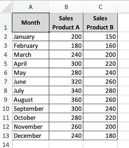
1. Prepare Your Data
Arrange your data in three columns. Let’s say Column A has the months (January to December), Column B has the sales figures for Product A, and Column C for Product B.
Ensure your data is clear and correctly labeled. This setup helps Excel understand what data should be represented in the chart.
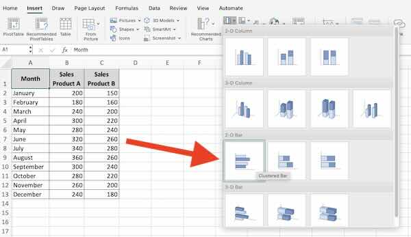
2. Insert a Bar Chart
Select the data range that includes your sales figures along with the month labels. Go to the ‘Insert’ tab on the file menu, click on ‘Bar Chart,’ and choose ‘Clustered Bar.’
This step creates a basic bar chart with two sets of bars for each month, representing the sales for Products A and B.
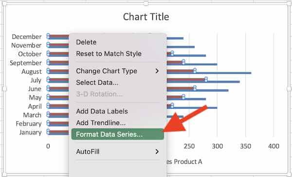
3. Change Series Overlap
Right-click on any bar in the chart, and select ‘Format Data Series.’ Find the ‘Series Overlap’ option and adjust it to 100%.
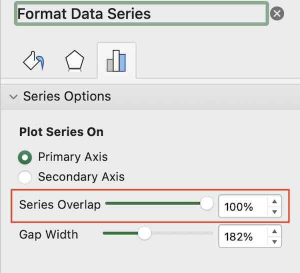
Adjusting the series overlap makes the bars for Product A and Product B overlap each other fully. This is crucial for comparing their values directly.
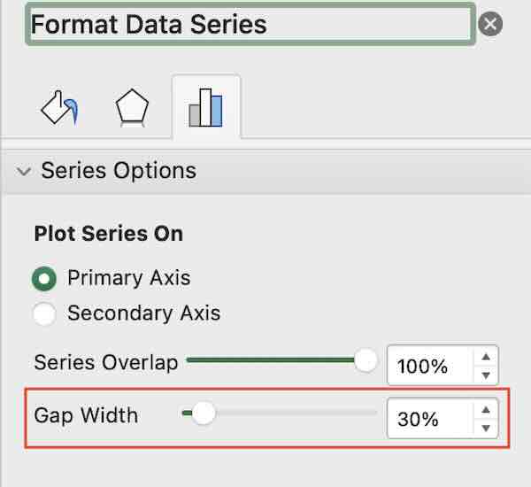
4. Adjust the Gap Width
Still in the ‘Format Data Series’ menu, find the ‘Gap Width’ option. Reduce this to 30% to make the bars thicker.
Reducing the gap width makes it easier to compare the two products by making the bars more prominent.
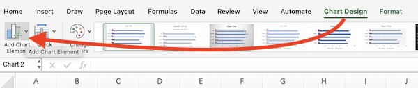
5. Customize the Chart Design
Click on the chart and then select ‘Chart Design’ under Chart Tools on the ribbon. Here, you can add chart elements like titles, labels, and legends.
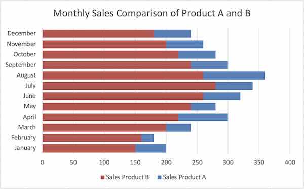
Add a chart title and axis labels to make your chart clearer. For example, title it “Monthly Sales Comparison of Product A and B.”
We hope you now have a better understanding of how to create an overlapping bar chart in Excel. If you enjoyed this article, you might also like our article on how to make a double bar graph in Excel or our article on how to sort bar charts in descending order in Excel.