Add Vertical Lines to an Excel Chart (Easiest Way in 2025)
In this article, we will show you how to add vertical lines to an Excel chart. Simply follow the steps below!
How to Add Vertical Lines in an Excel Graph
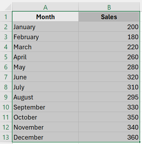
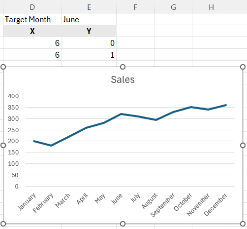
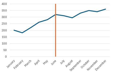
Here’s an example dataset with sales data over several months, and you want to highlight a significant event in June. For the purpose of this guide, we will use a standard line chart for our data.
1. Prepare Vertical Line Data
In one cell (E1), type the label for the data point where you want the vertical line. This label should match exactly how it appears in your source data. In this case, it should be “June”.
In cells D3 and D4, use the following formula to find the X position of your target data point:
=IFERROR(MATCH($E$1, $A$2:$A$7, 0), 0)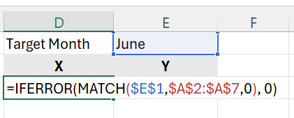
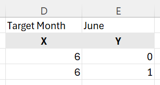
Enter the minimum and maximum Y values (usually 0 and 1) in cells E3 and E4. This sets the range for your vertical line within the graph.
Here’s what your data should look like:
2. Create the Line Chart
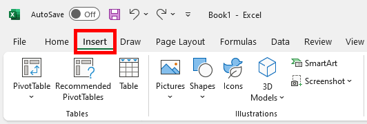
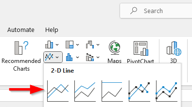
Highlight the range that includes your primary data. Go to the “Insert” tab, select “Charts,” then choose “Line” to create the initial graph of your main data.
3. Add the Vertical Line
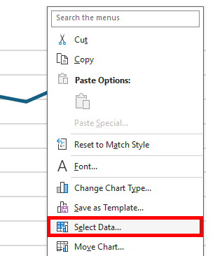
Right-click on the chart and select “Select Data”
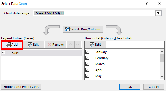
Click the “Add” button in the “Select Data Source” dialog box.
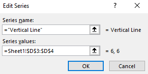
For “Series name”, you can enter “Vertical Line”. For “Series values”, select cells D3 and D4 (where your MATCH formula results are stored). Click OK.
4. Adjust Chart Type for the Vertical Line
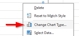
Right-click on the chart again and select “Change Chart Type”.
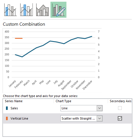
Choose “Combo” from the “All Charts” tab.
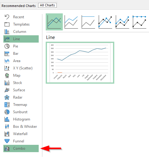
Set the main data series to “Line”. Set the “Vertical Line” series to “Scatter with Straight Lines”. Ensure you check the “Secondary Axis” for the Vertical Line series for proper alignment and scaling.
5. Edit the Vertical Line Series
Right-click the chart again and choose “Select Data”. In the “Select Data Source” dialog box, select the “Vertical Line” series and click “Edit”.
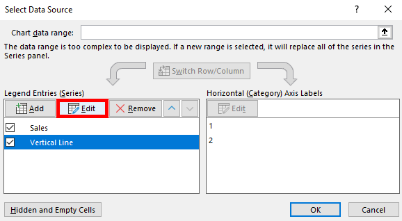
In the “Edit Series” dialog box, confirm the X and Y values are correctly set to the cells D3:D4 and E3:E4 respectively. Click “OK” to close each dialog box.

6. Format the Vertical Line
Right-click the secondary Y-axis (which should now be active due to the scatter series). Select “Format Axis”.
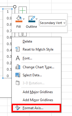
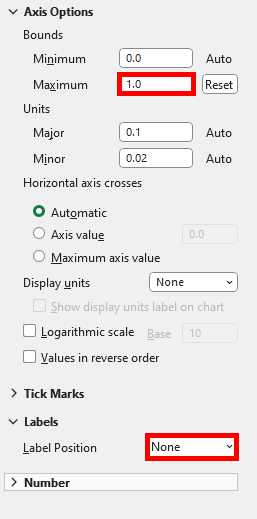
Under “Axis Options”, set the “Maximum” bound to 1 to make sure the line spans the entire Y-range of the chart. Optionally, hide the secondary Y-axis by setting “Label Position” to None.
Here’s what the final chart looks like:
We hope that you now have a better understanding of how to add vertical lines to an Excel chart. If you enjoyed this article, you might also like our articles on how to insert column sparklines in Excel and how to remove page break lines in Excel.

