How to Change Bar Graph Colors in Excel Based on Value (2025)
In this article, we will show you how to change bar graph colors in Excel based on a value. Simply follow the steps below.
Change Bar Chart Color Based on a Value in Excel
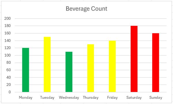
To change the bar chart color based on the value in Excel, we will work on a bar chart that displays the daily beverage count sold at a cafe over a week. Follow the steps below:
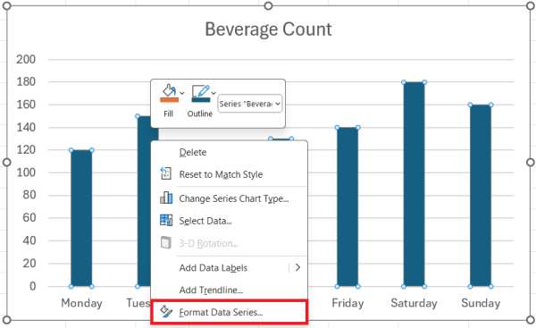
1. Access the Format Data Series Pane
Click on the bar chart to select it. Then, right-click on any of the bars in the chart and select ‘Format Data Series‘ from the context menu. This will open the Format Data Series pane on the right side of your Excel window.
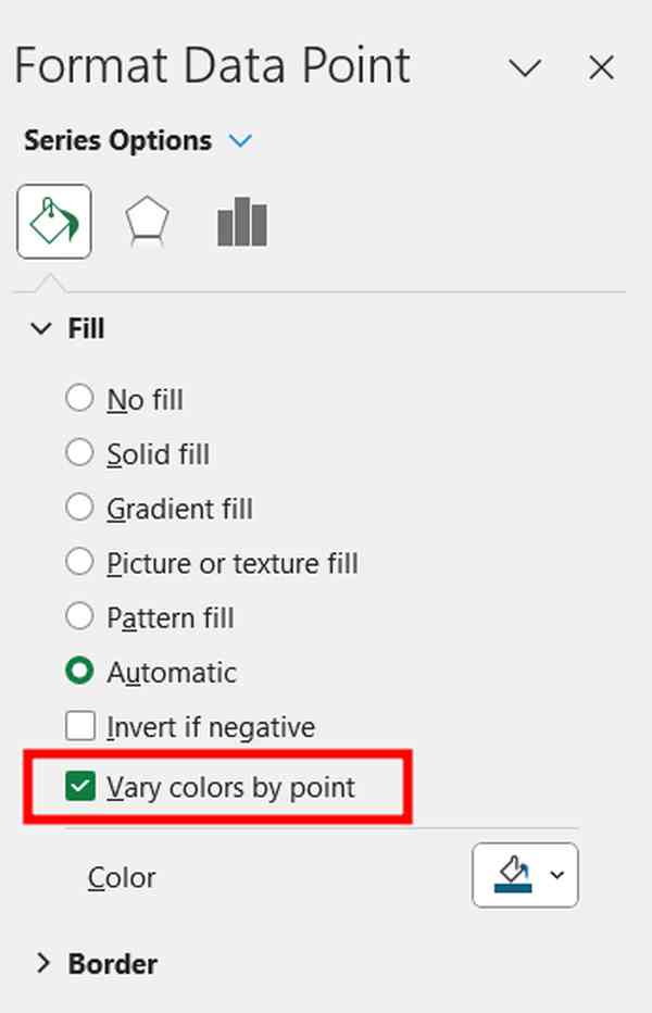
2. Choose Individual Colors for Each Bar Segment
In the Format Data Series pane, look for the option labeled ‘Fill.’ Under this, you should find ‘Vary colors by point.’ Click this checkbox to enable individual color settings for each bar in the chart.
3. Set Specific Colors for Different Beverage Count
With ‘Vary colors by point’ enabled, click on each bar individually to select it. Once a bar is selected, go back to the ‘Fill‘ section in the Format Data Series pane and choose ‘Solid Fill.‘ Then, go to ‘Colors’ to select the fill color.
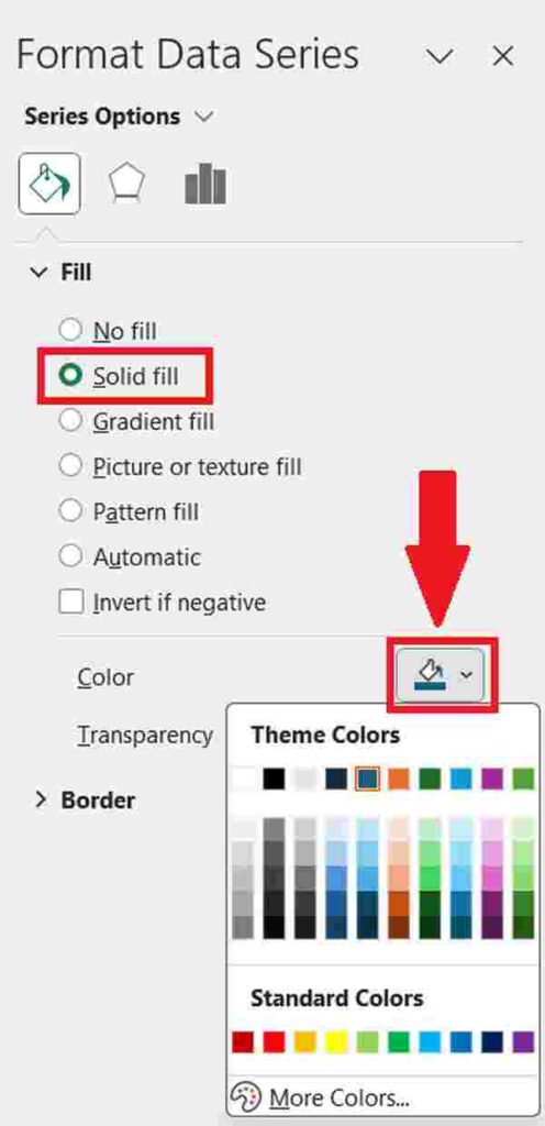
Select a color that corresponds to the sales volume:
For high sales (e.g., above 150 units), choose a vibrant color like red.
For medium sales (e.g., between 130-150 units), select a color like yellow.
For low sales (e.g., between 100-130 units), opt for a calmer color, like green.
We hope that you now have a better understanding of how to change bar graph colors in Excel based on a value. If you enjoyed this article, you might also like our article on how to increase the width of a bar chart in Excel or our article on how to color a bar chart by category in Excel.