How to Make a Box and Whisker Plot in Excel (2025 Update)
In this article, we will show you how to do a box and whisker plot in Excel. Simply follow the steps below.
How to Create a Box and Whisker Plot in Excel
To make box and whisker plots in Excel, simply follow the steps below.
1. Select Your Data Range
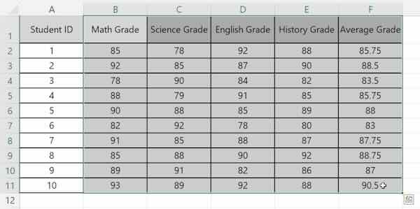
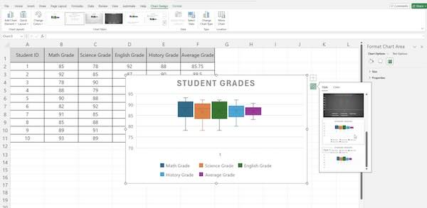
For example, you might have test scores for students in different classes. Your data should be organized in columns. Highlight the range of data you want to use for your box and whisker plot. For example, select the column with student test scores.
2. Insert a Box and Whisker Chart
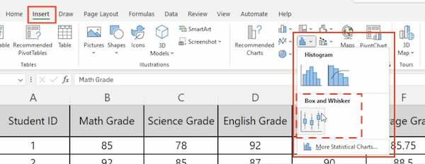
Go to the “Insert” tab. Click on the “Insert Statistical Chart” button. Choose “Box and Whisker.”
3. Adjust the Chart Elements
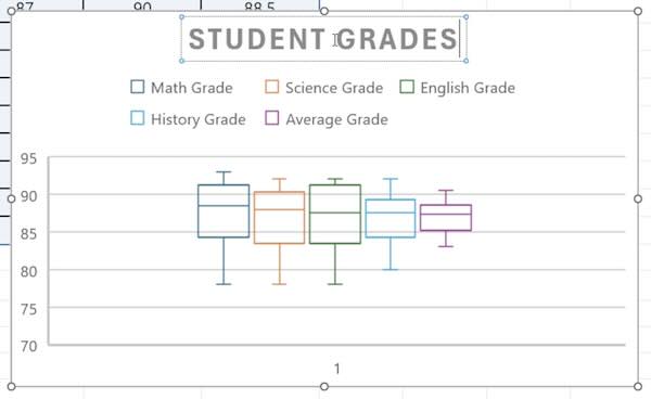
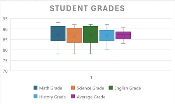
Click on the chart to select it. Use the “Chart Elements” button to add or remove elements like titles, labels, and gridlines. For example, add a chart title like “Student Grades.”
4. Format the Chart
Use the “Chart Tools” on the ribbon to format your chart. Adjust colors, fonts, and styles to make it clear and readable.
5. Interpret the Box and Whisker Plot
Look at the plot to understand your data. The box represents the interquartile range. The line inside the box is the median. Whiskers show the range of the data.
We hope you now have a better understanding of how to make a box and whisker plot in Excel. If you enjoyed this article, you might also like our article on how to fit text in an Excel box or our article on how to compare two dates in Excel.

