How to Create Clustered Stacked Bar Chart in Excel (2025 Update)
In this article, we will show you how to add an Excel clustered stacked bar chart. Simply follow the steps below.
Insert Excel Clustered Stacked Bar Chart
To make a clustered stacked bar chart in Excel, simply follow the steps below.
1. Prepare Your Data
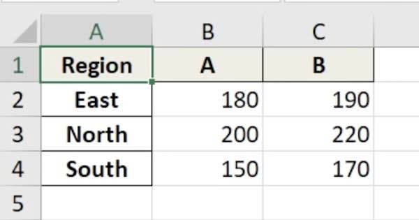
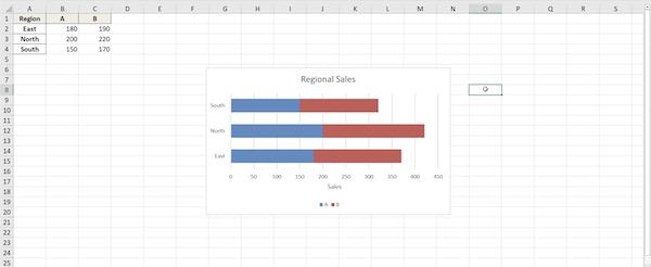
Arrange your data in a clear and organized format. For our example, imagine you have two products (Product A and Product B) and sales data from three regions (North, South, East). Structure your data in columns: the first column for regions, the next for Product A, and the third for Product B.
2. Insert a Stacked Bar Chart
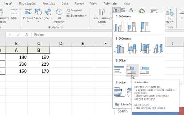
Select your data range, then go to the Insert tab. Click on Bar Chart and choose Stacked Bar from the dropdown menu. This inserts a basic stacked bar chart into your sheet.
3. Customize Your Chart for Better Presentation
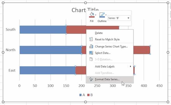
Right-click on the chart and choose Format Data Series. Adjust the gap width to make the bars closer or further apart. Change colors to differentiate between products more clearly.
4. Add Chart Elements to Enhance Readability
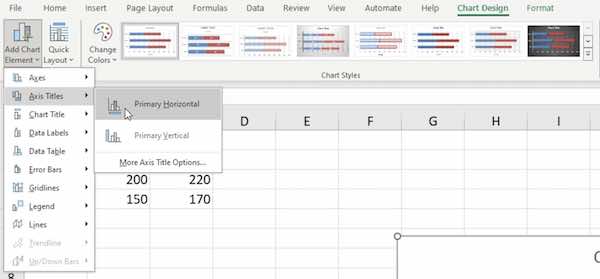
Go to the Chart Design tab. Click Add Chart Element. Choose to add a chart title, axis titles, and a legend. Clearly label each axis to reflect what the data represents.
5. Finalize and Review
Review your chart to ensure all data is accurate and clearly represented. Make any final adjustments to the layout and style to ensure the chart is both informative and visually appealing.
We hope you now have a better understanding of how to create a clustered stacked bar chart in Excel. If you enjoyed this article, you might also like our article on how to make a clustered bar chart in Excel or our article on how to add a search bar in Excel.

